
Positioning foundation
We describe your audience, category, distinguishing approach and supporting evidence before making decisions about visual direction.
A recognisable brand starts with a clear idea of who you serve and what you stand for. We translate that thinking into language, visual identity and working guidelines that keep your business coherent wherever it appears.

We describe your audience, category, distinguishing approach and supporting evidence before making decisions about visual direction.
Logo applications, typography, colour and image direction are developed as a connected system across relevant business touchpoints.
We shape your core story, service language and writing principles, with examples that show how the voice changes by context.
Your team receives practical rules, reusable assets and priority applications so the identity can continue beyond the initial presentation.
Before discussing a logo, we examine how you explain the business, who needs to understand it and where alternatives look interchangeable. Interviews and existing materials help separate meaningful differences from generic claims. The resulting positioning gives the design work a direction and gives your team a shared explanation of the brand.
A professional services firm, for example, might need to communicate a specialised approach that is currently hidden behind broad claims about quality. We would examine how that approach can be evidenced and explained before selecting a visual treatment. Those decisions give the identity a reason to look and sound the way it does, rather than depending on personal taste alone.
An identity must work on a mobile screen, inside a proposal and across campaign creative. We test the system in these settings rather than judging it only on presentation mockups. Where communication uses more than one language, typography and layout decisions account for those requirements from the beginning.
We choose representative applications that expose real design decisions: a compact website header, a document with detailed information or a social graphic viewed on a phone. These tests show whether the typography remains readable and the identity remains recognisable at different sizes. They also reveal where your team needs a practical rule instead of another polished mockup that cannot be reproduced.

Material, colour and composition choices make a proposed direction easier to review.
A rebrand can affect website content, profiles, documents and familiar customer touchpoints. We identify what should change first and which existing elements still carry recognition. The engagement scope records the assets, applications and handover material required, with a review path that makes feedback specific and decisions traceable.
The rollout should respect how customers already encounter the business. We can identify an order for updating visible touchpoints and record items that depend on another supplier or internal approval. A useful handover makes clear which files are final, how to select an appropriate version and where the team should look when a new application raises a design question.
A business can outgrow the way it presents itself without needing to abandon every familiar element. We look at what customers already recognise and which parts of the identity no longer support the current offer. This separates a specific consistency problem from a broader positioning question.
The work may focus on clearer language, a more usable design system or a wider identity change. Where the website is the main point of friction, website redesign can be coordinated with the brand decisions rather than treated as an unrelated visual exercise.
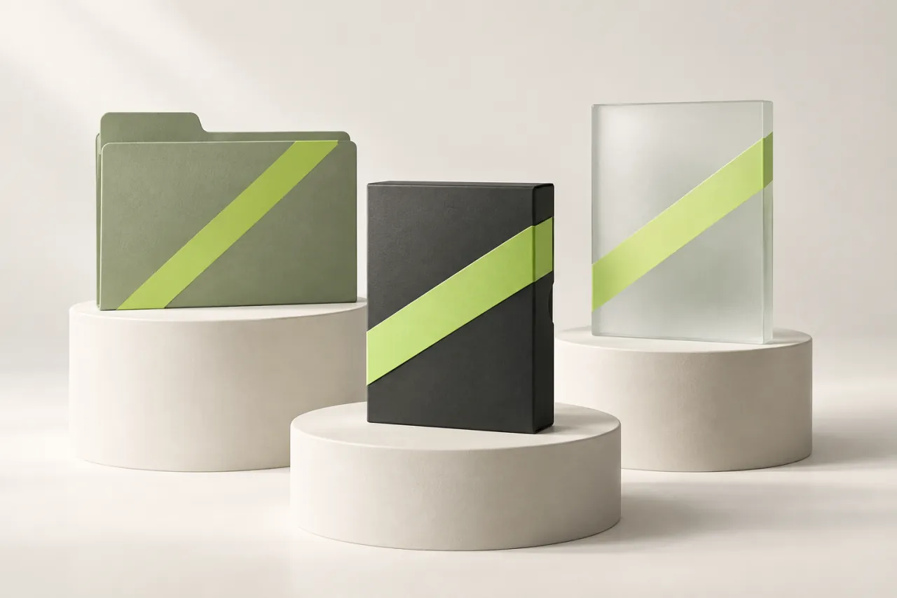
A usable handover shows how the same visual choices work across different applications.
Creative feedback is most useful when it explains what is not working for the intended audience or application. We present the reasoning behind a direction so the discussion can refer to positioning, readability and practical use. This gives stakeholders a shared basis for making a decision.
For example, a retailer might prefer a quieter visual system because the products already provide strong colour and detail. That is a brief-led decision, not a claim that one design style suits every business in the same industry.
The handover can include appropriate logo versions, colour references, type guidance and examples of message hierarchy. We also identify common errors to avoid and the approved starting points for everyday documents or creative work. The intended users influence how detailed that guidance needs to be.
A related social content programme or website writing project can then apply the same principles. This helps the identity remain coherent when different people create material after the initial branding engagement has finished.
We explore your audience, business direction and existing communication to define the central brand challenge.
We present a reasoned creative approach and explain how its choices respond to the agreed positioning.
We refine the selected direction across representative applications, checking consistency, readability and practical use.
We organise the final assets and demonstrate how to use the identity in everyday communication.
Yes. We first identify what remains useful and recognisable. The work may focus on clearer messaging, more consistent applications or specific visual improvements.
It can be included when needed. Naming requires its own research and review scope; any formal name clearance needs appropriate independent checks.
The agreed handover specifies the editable assets and application formats included. We also document any third-party font or image usage requirements that affect future use.
We agree who contributes and who approves the direction, with feedback consolidated against the brief. This helps distinguish a concern about audience or application from conflicting individual preferences that cannot all define the final identity.
We can include the required language applications in the scope and assess typography, layout and message hierarchy accordingly. Any language-specific wording or typesetting needs the appropriate review before those materials are approved.
A focused engagement can review the existing identity and create clearer application rules or reusable assets. We would first identify what already works so the project addresses the inconsistencies without replacing useful recognition unnecessarily.
Tell us what you’re working towards. We’ll help you make sense of the next step.
+92 302 0152939hello@marketingconsultantislamabad.comYour enquiryBranding
Read our privacy policy before sharing your details.
Open the form in a new tab